VERTICAL NAVIGATION MENU COMPONENT
How to create a reusable multi-level vertical navigation menu component within the Power Apps Canvas App with only a gallery and a button.
Primary Steps
Once you have created a Canvas App, add the following code inside the App.OnStart:
1 | // Create a table to store the navigation menu values |
This will allow the app to recognise what screen is active and what screen to navigate to when selecting a menu item.
NOTE: If there is a navigation item you wish to hide, simply change the Visible value to false.
Component
In the components section, add a new component.
Component Properties
Set the “Access App Scope“ toggle to On.
Give the component a background colour. (Optional)
Custom Properties
Add the following custom properties to the newly created component:
| Name | Type | Data Type | Value |
|---|---|---|---|
| cmpWidth | Input | Number | 264 |
| cmpHeight | Input | Number | App.Height |
| PrimaryColor | Input | Color | enter a desired colour |
| SecondaryColor | Input | Color | enter a desired colour |
| MenuItems | Input | Table | Sort(Filter(colMenuBar, Visible), "ID", Ascending) |
| MultiScreenNav | Input | Boolean | false |
| SelectedMenu | Output | Record | First(colSelectedMenu) |
The MultiScreenNav will be useful if you want to change the selected menu item without changing screen.
The SelectedMenu will order the navigation menu by ID in ascending order (from top to bottom).
Set the component’s Width property to: cmpMenuBar_Home.cmpWidth
Set the component’s Height property to: cmpMenuBar_Home.cmpHeight

Insert Gallery
Go to “Insert“, select “Layout“ and add a blank vertical gallery.
Add the following properties:
Items: cmpMenuBar.MenuItems
Width: Parent.Width
Height: Parent.Height
TemplateSize: 90
TemplatePadding: 0
Add Button
Inside the gallery, insert a button with the following properties:
BorderColor: Self.Fill
BorderThickness: 1
Color: If(ThisItem.IsSelected, White, DarkBlue)
DisabledFill: Self.Fill
Fill: If(!ThisItem.IsSelected, White, DarkBlue)
FocusedBorderThickness: Self.BorderThickness
Font: Arial
FontSize: 20
FontWeight: Semibold
Height: 70
HoverBorderColor: Self.BorderColor
HoverColor: Self.Color
HoverFill: Self.Fill
PressedBorderColor: Self.BorderColor
PressedColor: Self.Fill
PressedFill: Self.Color
RadiusBottomLeft: 5
RadiusBottomRight: 0
RadiusTopLeft: 5
RadiusTopRight: 0
Text: ThisItem.Value
Width: Parent.TemplateWidth - Self.X
X: 18
Y: (Parent.TemplateHeight - Self.Height)/2
For the Button.OnSelect, insert the following code:
1 | ClearCollect(colSelectedMenu,ThisItem); |
And that’s all for the component itself.
Screens
Now let’s head back to the Screens view.
Insert the component to the screens which need a navigation bar.
For the single-screen navigation menus, insert a toggle with the following properties:
OnCheck:
1 | Set(_varSelectedMenuItem, First(colSelectedMenu).Value); |
Default:
1 | !IsEmpty(colSelectedMenu) |
For each navigation menu component added to the screens, insert the following code to the MenuItems custom property:
1 | SortByColumns( |
For every navigating action, enter the following code in the OnSelect property:
NOTE: Wherever you use the Navigate() function, the code below should be inserted before.
1 | // ID=2 is the menu item ID to navigate to |
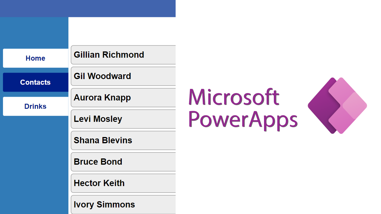
As you can see in the image below, this is the end result from the Contacts screen. I added a random contacts gallery and an Add button for demonstration purposes.

Examples of where I inserted the code above:
- on Form.OnSuccess
- Every Back button
- Every Add button
Feel free to customise the component to your needs. There are endless ways you can improve your implementation, for example, by adding an icon next to the navigation button for a more visually and functionally friendly user experience.
I hope you find this useful. For further questions, feel free to contact us via the Contact page on our website!