
13 February 2023 · By Ricardo Scollo
PowerApps: Create a Reusable Multi-Level Navigation Component
How to create a reusable multi-level vertical navigation menu component within a PowerApps Canvas App, using only a gallery and a button.
- PowerApps
- Power Platform
- Components
- Canvas App
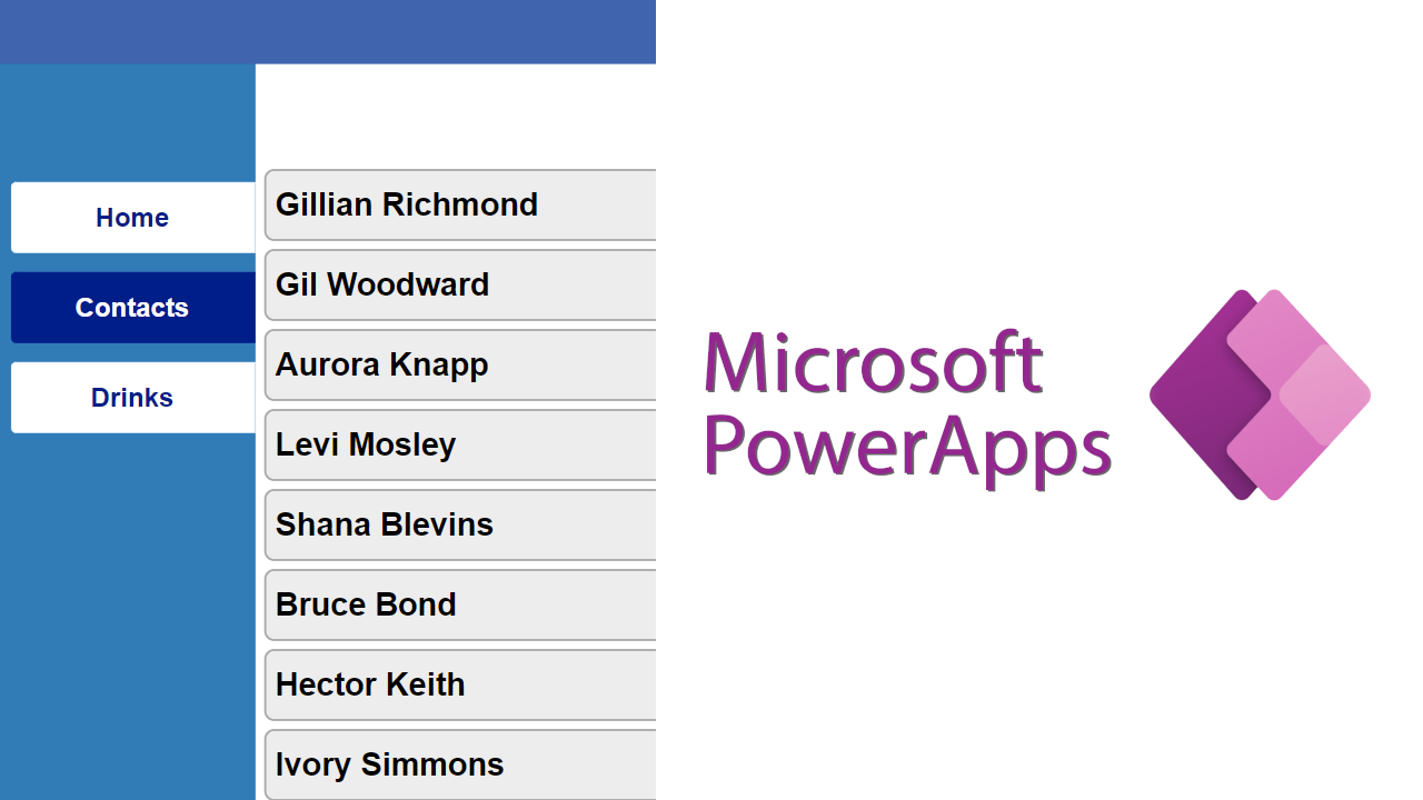
How to create a reusable multi-level vertical navigation menu component within a PowerApps Canvas App, using only a gallery and a button.
Primary steps
Once you have created a Canvas App, add the following code inside App.OnStart:
// Create a table to store the navigation menu values
ClearCollect(
    colMenuItems,
    Table(
        { ID: 1, MenuID: 1, Value: "Home",             Screen: Home,                Visible: true,  Selected: true  },
        { ID: 2, MenuID: 1, Value: "Contacts",         Screen: Contacts,            Visible: true,  Selected: false },
        { ID: 3, MenuID: 1, Value: "Drinks",           Screen: Drinks,              Visible: true,  Selected: false },
        { ID: 4, MenuID: 2, Value: "Contact Details",  Screen: ContactDetailsHome,  Visible: true,  Selected: false },
        { ID: 5, MenuID: 2, Value: "Hobbies",          Screen: ContactDetailsHome,  Visible: true,  Selected: false },
        { ID: 6, MenuID: 2, Value: "Favourite Drinks", Screen: ContactDetailsHome,  Visible: true,  Selected: false },
        { ID: 7, MenuID: 3, Value: "Drinks Edit",      Screen: DrinksEdit,          Visible: true,  Selected: false }
    )
);

// Set the default selected menu item
Set(_varSelectedMenuItem, Index(colMenuItems, 1).Value);
This allows the app to recognise which screen is active and which to navigate to when a menu item is selected.
Note: to hide a navigation item, change its
Visiblevalue tofalse.
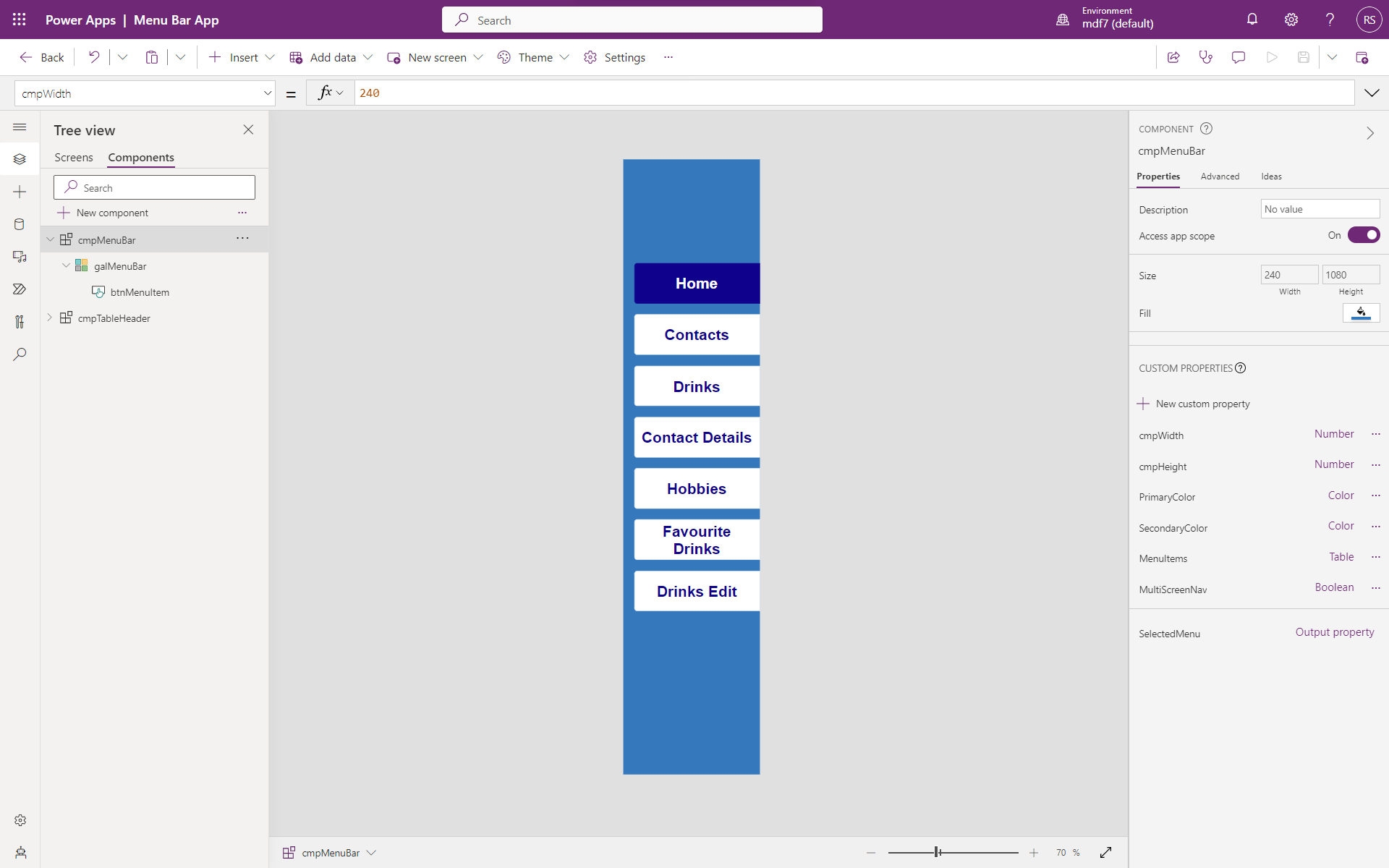
The component
In the Components section, add a new component.
Component properties
- Set “Access App Scope” toggle to
On. - (Optional) Give the component a background colour.
Custom properties
Add the following custom properties:
| Name | Type | Data type | Value |
|---|---|---|---|
cmpWidth | Input | Number | 264 |
cmpHeight | Input | Number | App.Height |
PrimaryColor | Input | Color | (desired colour) |
SecondaryColor | Input | Color | (desired colour) |
MenuItems | Input | Table | Sort(Filter(colMenuBar, Visible), "ID", Ascending) |
MultiScreenNav | Input | Boolean | false |
SelectedMenu | Output | Record | First(colSelectedMenu) |
MultiScreenNav is useful when you want to change the selected menu item without changing screen. SelectedMenu orders the navigation menu by ID ascending (top to bottom).
Set the component’s Width to cmpMenuBar_Home.cmpWidth and Height to cmpMenuBar_Home.cmpHeight.
Insert the gallery
Go to Insert → Layout and add a blank vertical gallery with:
- Items:
cmpMenuBar.MenuItems - Width:
Parent.Width - Height:
Parent.Height - TemplateSize:
90 - TemplatePadding:
0
Add the button
Inside the gallery, insert a button with the following properties:
- BorderColor:
Self.Fill - BorderThickness:
1 - Color:
If(ThisItem.IsSelected, White, DarkBlue) - DisabledFill:
Self.Fill - Fill:
If(!ThisItem.IsSelected, White, DarkBlue) - FocusedBorderThickness:
Self.BorderThickness - Font:
Arial - FontSize:
20 - FontWeight:
Semibold - Height:
70 - HoverBorderColor / HoverColor / HoverFill:
Self.*(mirror) - PressedBorderColor:
Self.BorderColor - PressedColor:
Self.Fill - PressedFill:
Self.Color - RadiusBottomLeft / TopLeft:
5 - RadiusBottomRight / TopRight:
0 - Text:
ThisItem.Value - Width:
Parent.TemplateWidth - Self.X - X:
18 - Y:
(Parent.TemplateHeight - Self.Height) / 2
For the Button.OnSelect:
ClearCollect(colSelectedMenu, ThisItem);
UpdateIf(
    colMenuItems,
    Value =  First(colSelectedMenu).Value, { Selected: true  },
    Value <> First(colSelectedMenu).Value, { Selected: false }
);
If(
    cmpMenuBar.MultiScreenNav,
    Navigate(First(colSelectedMenu).Screen)
);
That’s all for the component itself.
Wiring up screens
Insert the component on the screens that need a navigation bar.
For single-screen navigation menus, insert a toggle with:
- OnCheck:
Set(_varSelectedMenuItem, First(colSelectedMenu).Value); Clear(colSelectedMenu); - Default:
!IsEmpty(colSelectedMenu)
For each navigation component added to a screen, set the MenuItems custom property to:
SortByColumns(
    Filter(
        colMenuItems,
        // replace MenuID with the designated id
        MenuID = 1
    ),
    "ID",
    Ascending
)
For every navigating action, insert the following before any Navigate():
// ID = 2 is the target menu item ID to navigate to
Set(_varSelectedMenuItem, LookUp(colMenuItems, ID = 2).Value);

UpdateIf(
    colMenuItems,
    MenuID =  1, { Selected: Value = _varSelectedMenuItem, Visible: true },
    MenuID <> 1, { Selected: Value = _varSelectedMenuItem, Visible: true }
);

Navigate(Contacts);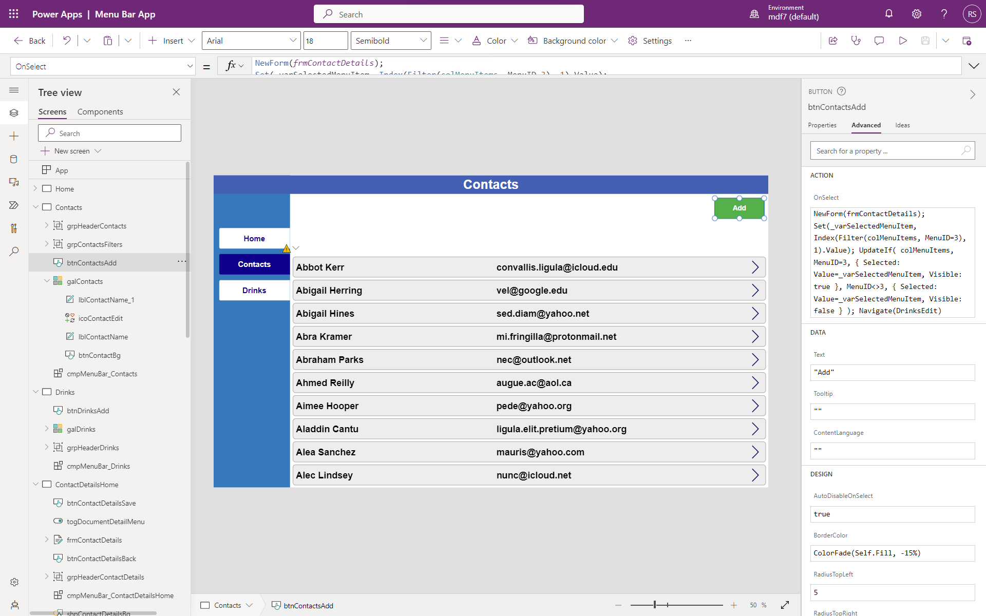
Typical places to put this code:
Form.OnSuccess- Every Back button
- Every Add button
Customise to taste. There are endless ways to improve, for example by adding an icon next to the button text for a friendlier UX.
For further questions, feel free to contact us.